Overview
SharePoint Framework Extension are the replacement for Custom Actions, JS Link, and more for Modern Pages in Office 365 and SharePoint 2019. Whether you’ve started experimenting with the SharePoint Framework or not, come find out exactly what the Extensions are, when to use them, limitations, and advantages. SharePoint Framework Extensions are not only powerful and flexible tools to customize SharePoint, when it comes to modern pages, they’re the only way. With SharePoint Framework Extensions, you can customize more facets of the SharePoint experience, including notification areas, toolbars, and list data views. SharePoint Framework Extensions are available in all Office 365 subscriptions for production usage.
Below are the extension types that SharePoint Framework contains:
- Application Customizers : Embeds visible or hidden scripts on a page, and uses predefined HTML element placeholders and extends them with customized renderings. Scope: Site collection, site or list.
- Field Customizers: It provides customized views to data within list fields can be used to override field view in a list. Also it can be used with site columns or directly on the list columns.
- Command Sets: It Allows to extend SharePoint command surfaces, adding new actions with client-side scripts that can be used to implement behaviors. Also provides action buttons to a list.
In addition to plain JavaScript, you can develop extensions alongside common scripting frameworks, such as AngularJS and ReactJS. For an instance, you can use Office UI Fabric React components to create experiences based on the same components used in Office 365.
SharePoint Framework extensions currently do not support classic list and library views. They only work for modern team sites.
Part 1 – Build your first extension
SharePoint Framework (SPFx) Extensions are basically client-side components that run inside SharePoint page context. You can build extensions using modern JavaScript tools and libraries and deploy extensions to SharePoint Online.
Step 1 :
Open Node.js Command Prompt. By default, CMD set default user location C:\Users\ _PCName_ and create a new project directory in your preferred location using below command.
md app-extension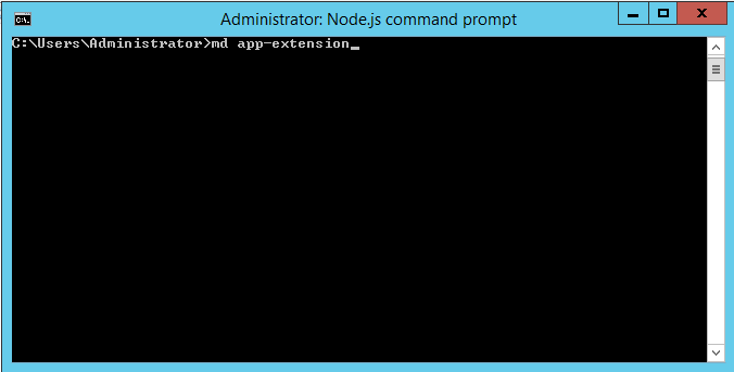
Step 2 :
Move to the newly created project directory using below command.
cd app-extension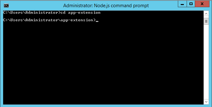
Step 3 :
Create a new AppCustomizer extension by running below Node.js command prompt.
yo @microsoft/sharepoint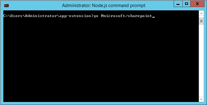
Step 4 :
Provide required information when prompted:
- Keep the default app-extension for “What is your solution name?” and select Enter.
- Keep SharePoint Online only (latest) for “Which baseline packages do you want to target for your component(s)?” and select Enter.
- Keep Use the current folder for “Where do you want to place the files?” and select Enter.
- Select N to allow solution to be deployed to all sites immediately.
- Select N on the question if solution contains unique permissions.
- Choose Extension for “Which type of client-side component to create?”
- Select Application Customizer as extension type from the list of available options.
As soon as you select Application Customizer, next group of prompts asks for information regarding your extension.
- Add AppCustomizer as your extension name, and press Enter.
- Keep the default AppCustomizer description for “What is your Application Customizer description?” and select Enter.
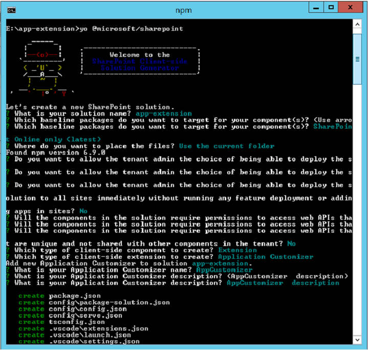
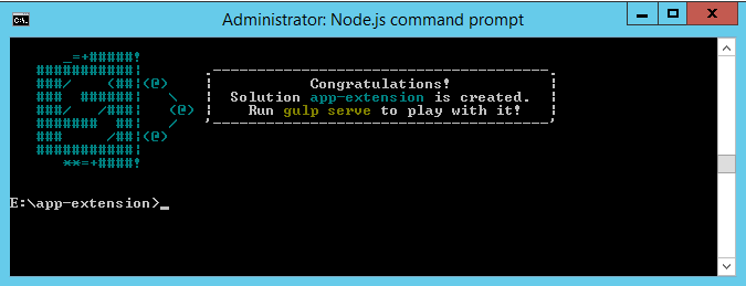
When scaffolding is done, you will be indicated a successful scaffold message.
Step 5 :
Next, type the following into the console to start Visual Studio Code
code .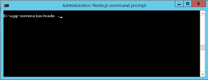
Notice how the default solution structure looks like the solution structure for client-side web parts. This is the basic SharePoint Framework solution structure, with similar configuration options across all solution types.
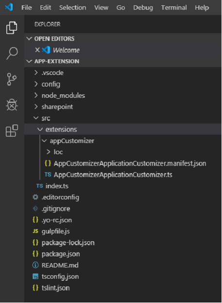
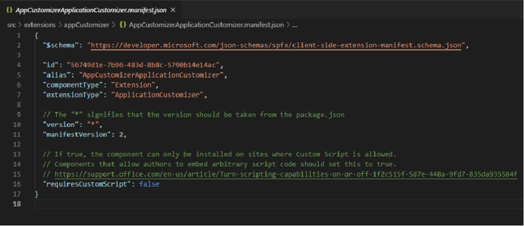
Open AppCustomizerApplicationCustomizer.manifest.json in the src\extensions\appCustomizer folder.
This file contains extension type and a unique id for your extension.
AppCustomizerApplicationCustomizer.manifest.json
At this moment, Yeoman installs the needed dependencies and scaffolds the solution files along with the AppCustomizer extension. This may take some time.
When scaffolding is done, you will be indicated a successful scaffold message.
Application Customizer Code
Open the AppCustomizerApplicationCustomizer.ts file in the src\extensions\appCustomizer folder.
Notice that base class for the Application Customizer is imported from the sp-application-base package, which contains SharePoint framework code required by the Application Customizer.
AppCustomizerApplicationCustomizer.ts

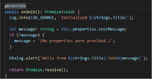
onInit method contains the logic for your Application Customizer, which is
called when the extension is first activated.
Below is the default solution having contents of onInit() method.
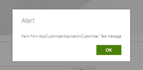
It writes a log and displays an alert when the page is loaded.
AppCustomizerApplicationCustomizer.ts
Debug Application Customizer
Local Workbench cannot be used to test SharePoint Framework Extensions. You can test extension using SharePoint Online site. However, you do not need to deploy your customization to the site.
Open up serve.json file from inside the config folder. This file has been modified based on your project default settings. You can observe that customActions element mentions a unique GUID.
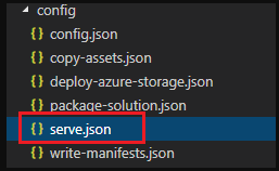
When project is scaffold, it is automatically updated. Whenever you require to add new components or modify specific properties, you will need to edit this file for testing purpose. Edit pageURL for your tenant, which you need to utilize for testing. You can use your preferred page URL having modern experience
For example – A welcome page or custom page of a modern team site or a publishing site, something like below URL:
https://domain-name/sites/dev/SitePages/AppCustomizer.aspx
Below is updated serve.json file containing your tenant details:
serve.json
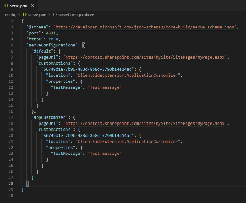
In your console, make sure that you are still in the app-extension directory. Enter below command:
gulp trust-dev-certRun below command to compile your code from your local computer/virtual machine:
gulp serveWhen code compilation is completed without any issues, it opens the resulting manifest from https://localhost:4321 in your default browser with required query parameters.
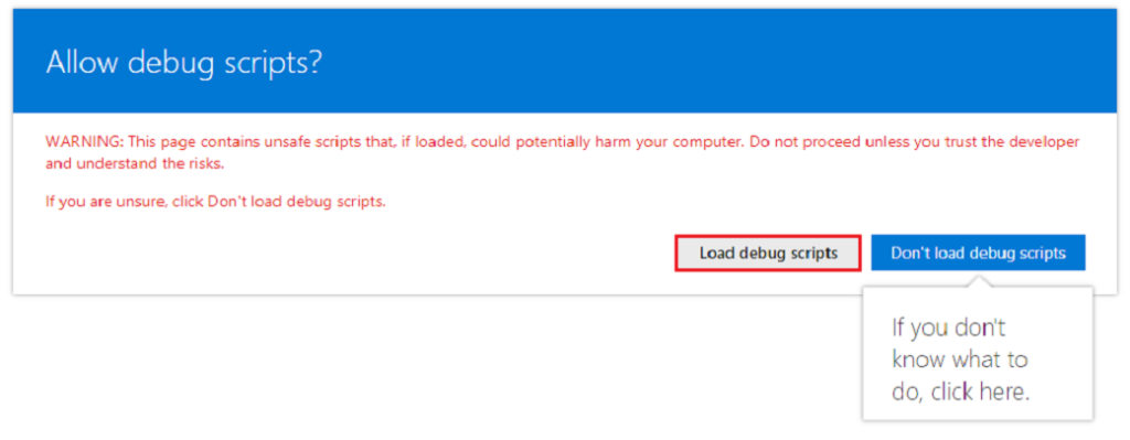
Navigate to your default browser and click Load debug scripts to proceed loading scripts from your local host.
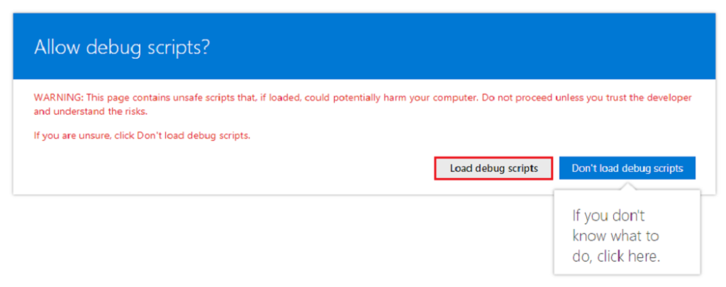
Below dialog message will now appear on your page.
Part 2 – Page Placeholders from Application Customizer
Use Page Placeholders from Application Customizer
Application Customizers provide access to SharePoint page components that you can customize based on your business needs. For an instance, you can use SharePoint Framework application customizer to render a custom header and footer experience on all SharePoint Online modern pages.
This model complements SharePoint Hosted add-in that includes a UserCustomAction collection to render custom header and footer through JavaScript and configuration interface. The key difference here is that SharePoint Framework (SPFx) Extensions won’t change your page elements even if HTML/DOM structure is changed.
Get access to page placeholders
You can specify the scope (Site, Web or List) to decide where to register Application Customizer in your tenant.
To get access to the placeholder, use below method.
Get access to the placeholder
// Handling the Bottom placeholder
    if (!this._bottomPlaceholder) {
      this._bottomPlaceholder =
        this.context.placeholderProvider.tryCreateContent(
          PlaceholderName.Bottom,
          { onDispose: this._onDispose });
    ...
    }
You have full access over what to render to the user once you fetch the placeholder object.
Here you are accessing a familiar placeholder by using respective identifier i.e. the code accesses footer inside the page using Bottom identifier.
Modify Application Customizer to access and modify placeholders
You will need to install @microsoft/sp-office-ui-fabric-core to render placeholders on the page by importing styles from SPFabricCore.scss.
- Install the
@microsoft/sp-office-ui-fabric-corepackage to enable importing from SPFabricCore.scss. We will use this for defining rendering styles for our place holders.
npm install @microsoft/sp-office-ui-fabric-core - Create a new file named AppCustomizer.module.scss under the src\extensions\appCustomizer folder.
- Update AppCustomizer.module.scss with styles used in the HTML output for image as well as header and footer placeholders:
AppCustomizer.module.scss
.app {
    .top {
        text-align:center;
        line-height:2.5;
        font-weight:bold;
        display: flex;
        align-items: top;
        justify-content: top;
        background-color: #3a3c3f;
        color: $ms-color-white;
        padding: 10px;
    }
    .bottom {
        height:40px;
        text-align:center;
        line-height:2.5;
        font-weight:bold;
        display: flex;
        align-items: center;
        justify-content: center;
        background: #111111;
        color: $ms-color-white;
    }
}
Open src\extensions\appCustomizer\AppCustomizerApplicationCustomizer.ts in your code editor. Import PlaceholderContent and PlaceholderName from @microsoft/sp-application-base library by adding below lines:
AppCustomizerApplicationCustomizer.ts
import {
  BaseApplicationCustomizer,
  PlaceholderContent,
  PlaceholderName
} from '@microsoft/sp-application-base';
After strings import at the top, add below import statements.
AppCustomizerApplicationCustomizer.ts
import * as strings from 'AppCustomizerApplicationCustomizerStrings';
import styles from './AppCustomizer.module.scss';
import { escape } from '@microsoft/sp-lodash-subset'
You use escape to escape App Customizer properties. You’ll define styles for the render in the following steps. Modify IAppCustomizerApplicationCustomizerProperties interface to add required properties for Header, Logo and Footer in AppCustomizerApplicationCustomizer.ts file, as follows.
AppCustomizerApplicationCustomizer.ts
export interface IAppCustomizerApplicationCustomizerProperties {
  // This is an example; replace with your own property
  Top: string;
  Bottom: string;
}
In the AppCustomizerApplicationCustomizer class, add below private variables. In this case, variables can be defined locally in onRender method, though if you require to share them with other objects, define the variables as private.
AppCustomizerApplicationCustomizer.ts
    @override
    public onInit(): Promise<void> {
      Log.info(LOG_SOURCE, `Initialized ${strings.Title}`);
      this.context.placeholderProvider.changedEvent.add(this, this._renderPlaceHolders);

      return Promise.resolve<void>();
    }
Create a new _renderPlaceHolders private method with the following code:
private _renderPlaceHolders(): void {
 		console.log("HelloWorldApplicationCustomizer._renderPlaceHolders()");
 		console.log(
 			"Available placeholders: ",
 			this.context.placeholderProvider.placeholderNames
 				.map(name => PlaceholderName[name])
 				.join(", ")
 		);

 		// Handling the top placeholder
 		if (!this._topPlaceholder) {
 			this._topPlaceholder = this.context.placeholderProvider.tryCreateContent(
 				PlaceholderName.Top,
 				{ onDispose: this._onDispose }
 			);

 			// The extension should not assume that the expected placeholder is available.
 			if (!this._topPlaceholder) {
 				console.error("The expected placeholder (Top) was not found.");
 				return;
 			}

 			if (this.properties) {
 				let topString: string = this.properties.Top;
 				if (!topString) {
 					topString = "(Top property was not defined.)";
 				}

 				if (this._topPlaceholder.domElement) {
 					this._topPlaceholder.domElement.innerHTML = `
 					<div class="${styles.app}">
 						<div class="${styles.top}">
 							<i class="ms-Icon ms-Icon--Info" aria-hidden="true"></i> ${escape(
 								topString
 							)}
 						</div>
 					</div>`;
 				}
 			}
 		}

 		// Handling the bottom placeholder
 		if (!this._bottomPlaceholder) {
 			this._bottomPlaceholder = this.context.placeholderProvider.tryCreateContent(
 				PlaceholderName.Bottom,
 				{ onDispose: this._onDispose }
 			);

 			// The extension should not assume that the expected placeholder is available.
 			if (!this._bottomPlaceholder) {
 				console.error("The expected placeholder (Bottom) was not found.");
 				return;
 			}

 			if (this.properties) {
 				let bottomString: string = this.properties.Bottom;
 				if (!bottomString) {
 					bottomString = "(Bottom property was not defined.)";
 				}

 				if (this._bottomPlaceholder.domElement) {
 					this._bottomPlaceholder.domElement.innerHTML = `
 					<div class="${styles.app}">
 						<div class="${styles.bottom}">
 							<i class="ms-Icon ms-Icon--Info" aria-hidden="true"></i> ${escape(
 								bottomString
 							)}
 						</div>
 					</div>`;
 				}
 			}
 		}
 	}
You will need to create _renderPlaceHolders private method and add below code inside it: Add _onDispose method as shown below after completion of _renderPlaceHolders method. You can output below console message on removal of extension from the page.
AppCustomizerApplicationCustomizer.ts
private _onDispose(): void {
    console.log('[AppCustomizerApplicationCustomizer._onDispose] Disposed custom top
    and bottom placeholders.');
  }
You are now able to test the customizer in SharePoint Online.
Test Your Code
- Navigate to serve.json file inside the config folder and adjust the settings as we defined three new properties for the extension. Modify properties section to include Top, Bottom and Logo messages.
serve.json
{
{
  "$schema": "https://developer.microsoft.com/json-schemas/core-build/serve.schema.json",
  "port": 4321,
  "https": true,
  "serveConfigurations": {
    "default": {
      "pageUrl": "https://contoso.sharepoint.com/sites/mySite/SitePages/myPage.aspx",
      "customActions": {
        "56749d1e-7b96-483d-8b8c-5790b14e14ac": {
          "location": "ClientSideExtension.ApplicationCustomizer",
          "properties": {
            "Top": "Top area of the page",
            "Bottom":"Bottom area of the page"
          }
        }
      }
    },
    "appCustomizer": {
      "pageUrl": "https://contoso.sharepoint.com/sites/mySite/SitePages/myPage.aspx",
      "customActions": {
        "56749d1e-7b96-483d-8b8c-5790b14e14ac": {
          "location": "ClientSideExtension.ApplicationCustomizer",
          "properties": {
            "Top": "Top area of the page",
            "Bottom":"Bottom area of the page"
          }
        }
      }
    }
  }
}
2. Check for any errors in the console window that is executing gulp serve. If gulp reports any error, you need to fix the issues before proceeding further. Restart the solution if already running to apply updated changes inside serve.json file.
gulp serve3. Select Load debug scripts to continue loading scripts from your local host.
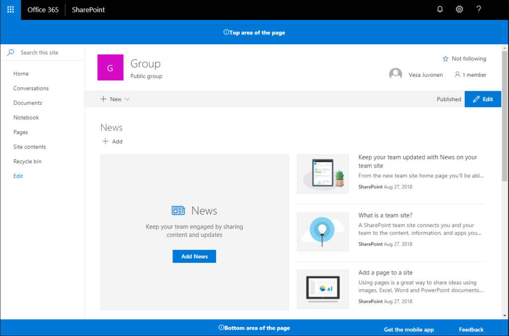
You should now see the custom header and footer content in your page.
Deploy the extension to SharePoint Online and host JavaScript from local host
You can now deploy the solution to the SharePoint site.
- Execute below command to package solution to get basic structure ready for packaging:
gulp bundle- Run below command to create solution package:
gulp package-solutionAbove command creates a package named app-extension.sppkg in sharepoint > solution folder.
- To deploy the package, navigate to app catalog and open the Apps for SharePoint library.
- Upload/drag and drop the app-extension.sppkg to Apps for SharePoint library inside App Catalog.
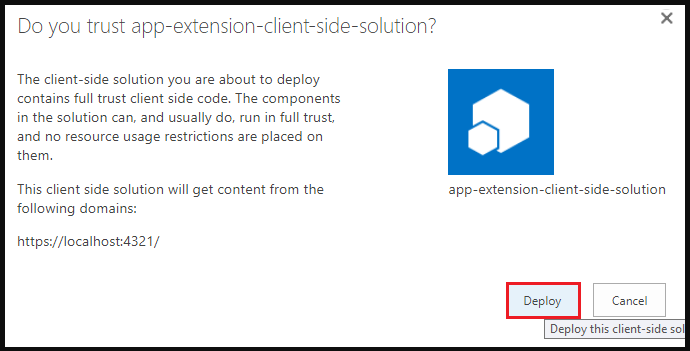
SharePoint displays a dialog and asks you to trust the client-side solution. Click Deploy button
Move back to your console and ensure that the solution is running. If it’s not running, execute the following command in the solution folder:
gulp serve –nobrowser- Go to the site where you want to test SharePoint asset provisioning. This could be any site collection in the tenant where you deployed this solution package.
- Select the gear icon on the top navigation bar on the right, and then select Add an app to go to your Apps page.
- In the Search box, enter app, and then select Enter to filter your apps.
- Select the app-extension-client-side-solution app to install the solution on the site. When the installation is completed, refresh the page by selecting F5.
When the application has been successfully installed, you can see the header and footer being rendered just like with the debug query parameters.
You have deployed an extension to a modern SharePoint page from the app catalog!
Very useful information
Thank You!